Buttons, Badges, Bumper Stickers:
Design Elements for a Great Promotional Product
Running a business and promoting your business aren’t always the easiest things to figure out, but there are lots of little things you can do to give your business a visibility boost without having to spend too much money or having to be heavily involved in sales and pitches and the like.
We’re talking about making use of passive advertising with promotional products.
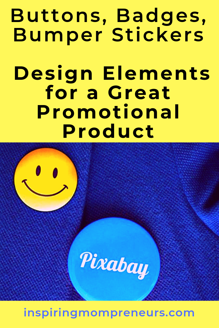
Promotional products are things like pins/pens, mouse pads, stickers, patches, water bottles, etc. that have your branding on it that businesses usually give away.
The idea behind these products is that clients or customers will make use of them and other people will see your business and either ask about you or look you up.
 Why Use Promotional Products
There are plenty of reasons to use promotional products. One of the great things about using promotional products to promote your business is that your business is not forgotten.
Even if those who have the products aren’t actively thinking about your business, your business will be one of the first to come to mind because they have been seeing the name of your business day in and day out as they use whatever your promotional product is.
Another reason to use passive promotions is because you want to increase your company’s visibility. Doing this should result in an uptick in the number of visits your site gets, the number of phone calls or new clients you receive and even an increase in sales or contracts.
And because promotional products are most often sold in bulk quantities, you will have plenty to include in your new client grab bags, free gift with purchase and “Thanks for stopping by,” gifts
They are an excellent tool to have when you are a vendor or have a booth set up at a community event or if you are trying to get started. There are so many ways that you can use these products and there’s no right or wrong way to use them.
How to Choose Promotional Products
So, now that you know why you should take advantage of promotional products, the next step is how to choose your promotional product. The product you choose does not have to be related to your business.
In fact, choosing an unrelated item may be the better option, because the goal is to attract business to your company and increase your visibility with the ultimate goal of increasing sales.
You can choose products that are associated with your business. For instance, you sell aeroplane parts. You could have pens, bumper stickers or paperweights that are shaped like aeroplanes. Matching the visual aspect to what your business actually does can be very helpful in creating automatic associations in the minds of potential customers.
Choosing products that are commonly used is also good. Pens, tote bags, patches, etc. are everyday use items that will be seen regularly, maybe even every day.
And the saying goes, “Repetition deepens the impression.” With this idea in mind, branding these types of products with your company’s name can really make a lasting impression as well.
Shop this website for a great selection of promotional products.
Using Design Elements
Knowing which products and how to implement the necessary design elements to make a great promotional product that pushes customers in your direction doesn’t have to be difficult.
Anyone can do it, you don’t have to be a graphic designer or have experience in visual branding in order to make your company pop off of the side of that water bottle or the face of that button.
Making good use of negative space, legible fonts, colours and size. These are simple things that make a big difference in the way that your company is seen.
A poor design can undermine your use of promotional products.
1. Negative Space
Negative space is simply the part of the visual, design or logo that is empty. It’s just like white space in a book, the margins, the space between the lines of text, the space between chronological shifts or chapters, etc..
Negative space helps to provide balance in a design and it gives the eye a break. By making good use of negative space you will be doing more good than harm.
If your product is fairly small, like a pen or a sticker, you should definitely take advantage of negative space. If you add too much to a smaller product, it becomes difficult to see, read and interpret.
2. Typography
Make good use of typography or font. Choosing a legible font is very important to branding a promotional item.
Above all else, you want it to be legible. If your message or branding is difficult to read, you increase the likelihood that people will not read it.
Consumers want things to be easy, so take the work out of reading and use a font that is easily legible.
It is nice to be able to use your company’s font on your branding material, but if your company’s font doesn’t scale down well, you should consider choosing different typography.
If the product you’re going to go with is large enough that a curly or more artistic font will be easily legible, go for it!
3. Colour
Depending on the product you choose, colour may not be an issue. But when thinking about colours you should consider ease of use more heavily than you consider your brand colours.
You want your design to stand out against the colour of the promotional product.
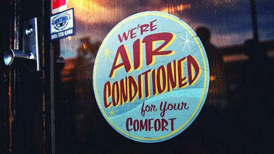
White typography on a light grey item may not be the easiest to read, but navy on white will be an easy read.
4. Size
When you’re designing what you want to go on your promotional product, you need to consider the size of your branding and the size of the product.
Don’t use a huge design on a pen and don’t use a small design on a bumper sticker. You want your branding to be balanced on whatever the product you choose.
Promotional items are a great way to put your company’s name out there for people to see and interact with. You can have better results when you use a few simple design elements that make a big difference in the way you are received.
Creating a well balanced and harmonious design is possible even if you have no experience in design. Give it a try.
Are you using promotional products in your business yet? It’s an idea I’ve been toying with for a while. And yes, when I go that route, I’d love to have a stab at designing my own. How about you?


